Dear Examiner,
I have really enjoyed the entire process of designing, and constructing my magazine. I feel as though I have gained a wide range of new skills and a large amount of experience. When searching through my blog, each post is clearly labelled and in order to make navigating a lot easier I hope you enjoy my magazine as much as I did when creating it!
Many Thanks,
Cameron Vear.
Thursday, 17 April 2014
Wednesday, 16 April 2014
Tuesday, 15 April 2014
Monday, 14 April 2014
Evaluation Question 5 - FINAL
I engaged my audience with a variety of methods, In order to have done this successfully; I had to preliminary research into what captivates my chosen audience type. For an innovative in inspiring magazine, I had to consider elements such as; the images, the colour schemes, particular models used and the accumulation of the pages that combine to create a unique magazine.
For my magazine, I chose a very simplistic house colour theme, with just black and white. However with such a basic colour scheme this allowed me to attract the attention to my models face which is covered in multi-coloured chalk. I believe that the colorful feature of her face and wildness of her hair connotes her breaking away from the conventions of society (Black and white) and the multicolours colour shows her own individual style. On my cover and contents, the colour feature is more flamboyant which will attract my target market, in comparison to the image used for my double page spread, but the house theme is present throughout.
The choice of images and how they are framed also add to the overall neatness and presentation of the magazine. My images have no borders because the page already has a large border, so I was careful to not over complicate the delicate page and to still have an aspect of simplicity present. This allowed the finish product to look neat and professional. When taking the photos, I used the studio and three lights, which allowed me to be able to control the amount of light in each image. It also allowed me to experiment with ideas to see which ones looked better. I used a Nikon D300 to take the images, and dressed my model in clothes chosen by myself to ensure that they fitted the genre of my magazine, as well as enrapture the audience’s attention. I purposely chose indie clothes for my model to wear as this would attract followers of indie culture, who make up a large percentage of my audience.
After producing research into my chosen target market, I found that being aesthetically different was a crucial factor that is presented widely among indie magazines. I made this element one of the most important as it was key to captivating my audience to maximum potential, showing and range of skills and abilities.
My double page spread appeals to my audience through the indie style of the layout and images that I produced. This is also developed through my artists appeal to my audience. She appeals to the male gaze of my audience and also her indie influences help to attract followers of indie fashion and culture. Her sense of style attracts my audience as she stands out from conventional models. The other artists on my contents fit into the indie rock genre and this will automatically make them likable for my audience.
Sunday, 13 April 2014
Evaluation Question 4 - FINAL

 My audience for this media product would be males aged 16-25 because I believe my artistic photography involved with in my magazine will attract their attention. With regards to the music genre of indie, it is largely a male fan base, due to girls being more involved in fan girling pop artists such as One Direction.
The artists that my target audience listen to are such like: Kings of Leon, Foals, Macklemore, The 1975 and Jake Bugg. They also are typically stereotyped to going to gigs most weekends with friends to listen to their particular favorite artists. Music is used s stress relief from doing A Levels because they take up a lot of time, decreasing levels of social life.
 My target audience shop at stores such as Top man and River Island, which are features I include in my magazine to attract ,my target audience. This would be beneficial; for publicity for theory companies, as well as creating business for the magazine company.
  There is a large access to this magazine for my target market as they will be accessible in areas where teenagers live. Such as newsagents.
 Saturday, 12 April 2014
Friday, 11 April 2014

Thursday, 10 April 2014
Evaluation Question 1 - FINAL
1. In what
ways does your media product use, develop or challenge forms and conventions of real media products? (i.e. of music magazines)
ways does your media product use, develop or challenge forms and conventions of real media products? (i.e. of music magazines)
To ensure that my magazine reached it’s maximum potential, I went through a research stage which involved looking at a variety of different magazine styles, as well as past work by other students. By doing this I found that magazines that follow a similar structures and conventions are the most successful. This is due to the detailed understanding of which target market the magazine is aimed at. With such a detailed understanding, they can chose a cover model that perfectly suits their target market and know how they need to be represented.
LOUD AND QUIET use the rule of thirds very effectively to present the magazine in a way it would stand out to on a shelf, and this is a technique that I wanted to adapt to my own design. I wanted The three main aspects of my cover to stand out-Masthead, image and content, each aspect crucial to my design. This is a very common convention used widely in the industry, along side the spiral effect which is generally used on images to ensure the main focal point of the photograph. However, I did not require the use of the spiral effect as the artistic elements of my cover image did enough to draw attention for not only those of my target audience, but other audiences as well, particularly if on a shelf with a variety of other magazines. In regards to colour, I also adapted the black and white house theme leaving just the central image to take focal point. By reducing the content of text on the page I was able to reduce the 'busyness' of the cover to increase the overall aesthetic.
When it came to designing my magazine I kept in mind the main conventions to ensure that elements fitted within my genre, however ensuring the individuality was still noticeable through out the design and layout.
For my masthead, I challenged the conventions with regards to colour by using white, which is not known for being bold or to stand out. I used a 'revolution' font due to it's bold style, and I developed the boldness through the use of overlapping the fonts. I used an overlap effect for my masthead, to be different, which is initially what the term 'indie' represents. I believe along with the font, this enables it to stand out and capture my target audiences attention. I placed the masthead slightly lower than the top of the page, to ensure that my border was used to great effect, and framed the photo, to show off it's artistic features especially the eyes, as these attract the male gaze. I also decided to not have anything over lapping the masthead, only the border because this also develops the covers individuality if on a shelf in a shop with a wide variety of other magazines.
The graphological features of my magazine are purposely there to ensure that it is diverse, and looks particularly different in comparison to every other magazine on the market, regardless of my magazine not being the only indie one. I found inspiration sources from magazines such as LOUD AND QUIET and Clash, due to their exquisite and artistic ways of presenting images and text with the use of negative space. I, however decided to break the conventions of these magazines and didn't use the negative space effect to the extent to which I wished to, because i felt that the images I produced with the chalk effect were artistic enough to attract my target audience, as well as others.
My favorite page with regards to the graphological features which I have presented is my cover, as I feel the 'revolution' font works when leaked into the border. I also like the sizing of my image, as it really presents the male gaze features which will attract my target audience, regardless of whether they follow indie music or not. This is also a house style which I have developed throughout the piece of work, as it links all pages together to show there is a connection.
When using conventional features with regards to photography, I decided to think outside the box and use chalk to give off a unique effect which allows focus to be drawn to that solely, rather than relying on the masthead to grab attention. I believe that this was a way of developing my photography skills to which would make my images seem more professional when looked at by my target market. I followed the conventions of a 'perfect' photograph because my model looked into the camera in all of the photos that I used in my magazine. This is to capture the audiences attention.
My magazine has challenged conventions to and extent, to ensure that it is diverse and individual. However I believe that I stuck by the most important ones, to ensure my magazine remained graphologically like a magazine.
Wednesday, 9 April 2014
DRAFT - Question 7
Looking back at your preliminary task (the continuity editing
task), what do you feel you have learnt in the progression
from it to full product?
I feel as though my ability to use different technologies and softwares has improved hugely. Because I primarily lacked knowledge of programs such as Photoshop and PagePlusXP during the preliminary task, It was not a detailed as it could have been. Before this coursework, I had never really used Photoshop, except for editing simple photographs. PagePlusXP was a brand new program I was taught how to use by my teacher, especially for this project. Also with the help of teacher and peer guidance, extra research, I improved my final product greatly.
As the course progressed, my knowledge of these programs improved very quickly, and I used them to what I believe was a high standard. With the many tricks and skills that I learned and adapted, I ensured that my final product was to the best of it's creativity and ability. By creating drafts, this allowed me to receive crucial feedback to work on, ensuring the most professional and cleanest finish possible.
With a lack of technology knowledge, and understanding of magazine conventions that make a magazine more successful, My preliminary magazine did not meet it's best potential and ability. However it was very useful in regards to developing my understanding of the technology and the skills required. Throughout the coursework I was constantly learning new tricks and skills, as well as still learning through the research that I carried out to widen my knowledge. In order for my to create a good magazine, I had to look deeper into my audience, fonts and house styles. This allowed me to produce the design that most compliments my chosen audience, by playing around with different styles during my draft. When choosing the correct consumer for my product, I had to be confident, and this is something I believe is important in the production of any media product.
When exploring conventions, I have learned that the most important is the image and overall layout of the magazine. Simplicity is something that is widely used, and this is I chose a simple colour scheme to ensure that the photograph is allowed to stand out. And image is a key way of attracting any particular audience. The house style of a magazine also ensures a magazine has a unique feel, therefore something that I felt was important to add. The development of my layout was critical at this point of progression. This is mainly due to the fact that I found in my research that males aged 16-25 appreciated the aesthetics of a product. I believe this is something I highlighted throughout my magazine with the help of technology.
During the preliminary work, my layout suffered badly as I was unaware of how important the F,Z and E designs were when ensuring that the magazine looked respectable when competing with other brands. I was also unaware of beneficial techniques such as the spiral effect and rule of thirds were, when spacing features perfectly and putting them across in the correct manor. The overall lack of creativity and convention was due to my uneducated approach to these techniques and conventions. Furthermore, it was not beneficial that my audience was not precisely identified, because the design and colour schemes were not researched in enough detail in order to show planning and development.
Overall, I have come to the conclusion that Photoshop is without a doubt the most useful tool in regards to the construction of my magazine, and without it I would have suffered when trying to produce such a high quality product. Even though programs like Paint and Word were came in handy during certain areas of the coursework, I feel they would have not allowed me to have been as detailed and creative in the construction of my product. My preliminary magazine highlights a large amount of progression, as I have made it evident that there was little knowledge and consideration in account of magazine conventions and styles.
DRAFT - Question 6
What have you learnt about technologies from the process
of constructing this product?
Throughout the coursework project I have used a wide range of technologies which I had did not have experience with prior to the production of my magazine. I was hesitant at first, but I quickly developed a detailed understanding and skill level which allowed me to created a final piece with aspects I would not have been able to produce before. These skills and knowledge kept me going throughout the course work, and have aided me to created a professional final product.
When taking my photos I used a Nikon D300 camera and the studio at school, this camera allowed me to take more detailed and defined photos for a neat and professional finish. As well as the camera, it was accompanied by three large filter lights, which allowed me to adjust the amount of light in each shot. Prior to my first photo shoot I was inexperienced with such a detailed and complicated camera, however after becoming more comfortable with all its aspects and features, my photo taking skills became more natural. I quickly learned how to photograph my model from a variety of angles and shots, as well as external places besides the studio. This skill has taught me how to determine which kind of shots are best for my model depending of what I want to capture in my photo. In regards to setting up the lighting equipment it was quite simple, however was not easily manoeuvrable, and this made taking outdoors shots very difficult. When taking my outdoor shots, I has to adjust the picture quality and resolution to compliment the natural light that I encountered.
Many programs I sourced from the computer enabled me to add detail and precision to my overall product. The main programmes used were PagePlusXP and Photoshop, both of which could be found on the school computers. However these were only accessible from the school computers which made it hard if work was required to be done at home. These pieces of software were most beneficial as they are what allowed me to experiment and created the layout of my magazine, and the overall finished product. Photoshop was used to alter all three aspects of my magazine, whereas PagePlusXP was only used for the construction of my double page spread, allowing me to adjust the column sizes and positioning.
Also many websites found on the internet were crucial for a variety of reasons;
Tumblr: Allowed me to source possible inspiration which I found useful when trying to find ideas that were 'outside the box'.
Facebook: A crucial tool in regards to organising my photo shoots and discussing ideas with my model.
Scribd: Uploading planning tasks that were available on my coursework blog.
Twitter: Allowed me to collect inspiration, and to communicate with my teachers during the course.
Without the tools that these sites have to offer, the production of my magazine would have been a lot more difficult than it had to be.
The windows package on the computers also became very useful during production. Microsoft Word allowed me to carry our my preliminary mind mapping for my article, research and planning. Paint was also useful, as the cropping tool made it easy for me to crop, edit and develop my product to ensure it met the best of it's potential.
For feedback, Twitter and Blogger were used equally. With the easy access and communication to teachers and peers that these sites allow, they enabled me to show evidence of support and opinion which was ongoing through the production of the coursework. These sources of technology made it easy for my to record and pinpoint areas of improvement, which has helped me to improve my potential grade. Evidence and planning was a massively important area of this coursework, and was a foundation of creating a successful magazine that would sell effectively to my chosen audience.
When looking for existent covers that could be used as inspiration, I looked at sites such as Magpile and Cover Junkie. By allowing me to research conventions and techniques used by other magazine designers, this ensured that my magazine would look as professional as possible, and the magazines would be crucial in showing the development throughout the process of production.
Tuesday, 8 April 2014
DRAFT - Question 5
I engaged my audience with a variety of methods, In order to
have done this successfully; I had to preliminary research into what captivates
my chosen audience type. For an innovative in inspiring magazine, I had to
consider elements such as; the images, the colour schemes, particular models
used and the accumulation of the pages that combine to create a unique magazine.
For my magazine, I chose a very simplistic house colour
theme, with just black and white. However with such a basic colour scheme this
allowed me to attract the attention to my models face which is covered in multi-coloured
chalk. I believe that the colourful feature of her face and wildness of her
hair connotes her breaking away from the conventions of society (Black and white)
and the multicolours colour shows her own individual style. On my cover and contents,
the colour feature is more flamboyant which will attract my target market, in comparison
to the image used for my double page spread, but the house theme is present throughout.
The choice of images and how they are framed also add to the
overall neatness and presentation of the magazine. My images have no borders
because the page already has a large border, so I was careful to not overcomplicate
the delicate page and to still have an aspect of simplicity present. This allowed
the finish product to look neat and professional. When taking the photos, I
used the studio and three lights, which allowed me to be able to control the
amount of light in each image. It also allowed me to experiment with ideas to
see which ones looked better. I used a Nikon D300 to take the images, and dressed
my model in clothes chosen by myself to ensure that they fitted the genre of my
magazine, as well as enrapture the audience’s attention. I purposely chose
indie clothes for my model to wear as this would attract followers of indie
culture, who make up a large percentage of my audience.
After
producing research into my chosen target market, I found that being aesthetically
different was a crucial factor that is presented widely amongst indie
magazines. I made this element one of the most important as it was key to
captivating my audience to maximum potential, showing and range of skills and abilities.
During the production of my final project, I took nearly 600 photos, with a range of poses and styles which I experimented with a the shoot progressed. I found this part quite challenging and finding the perfect combination of pose, lighting, angle and shutter speed was something that consumed a large amount of time, but was crucial. I then had to choose the pictures which portrayed my intent. once narrowed down, I chose two for my contents and front cover that had my model engaging with the audience. The shots I used were mid shots and had the perfect amount of light to make them look professional. I believe that the image I chose would connote a very strong feeling of independence and individuality, and this would leave an consumer intrigued, causing them to pick it up to read. Each photo was quite casual to suggest that she is a relaxed person, but still projecting the feel of unconventionalism.
Friday, 21 March 2014
DRAFT - Question 4
Who would be the audience for your media product?
My audience for this media product would be males aged 16-25 because I believe my artistic photography involved with in my magazine will attract their attention. With regards to the music genre of indie, it is largely a male fan base, due to girls being more involved in fan girling pop artists such as One Direction.
The artists that my target audience listen to are such like: Kings of Leon, Foals, Macklemore, The 1975 and Jake Bugg. They also are typically stereotyped to going to gigs most weekends with friends to listen to their particular favorite artists. Music is used s stress relief from doing A Levels because they take up a lot of time, decreasing levels of social life.
My target audience shop at stores such as Top man and River Island, which are features I include in my magazine to attract ,my target audience. This would be beneficial; for publicity for theory companies, as well as creating business for the magazine company.
There is a large access to this magazine for my target market as they will be accessible in areas where teenagers live. Such as newsagents.
Thursday, 20 March 2014
DRAFT - Question 3
What kind of media institution might distribute your media
product and why?
Bauer Media in my opinion would be the most beneficial
source of distribution for my product because I feel that it has connections
through media widely across Europe. Due to this company being Europe’s largest
distribution company in the media industry, with connections to businesses like
4Music and The Box, I believe as a magazine editor, this would benefit the
selling of it extremely.
This company have a relationship with distributing products
such as magazines, and broadcasted different types of media through radio,
however focuses predominantly on the distribution of magazines, therefore
meaning it has a wide market possibility. Due to the wide portfolio this
company have across the continent, it would distribute my magazine in a
positive light.
Due to the large portfolio, I believe that it would reach my
target audience successfully, and be distributed to exactly the correct stores
to which they would purchase my product from. This company have connections
with Q and Mojo magazine, which in my opinion are extremely successful. I feel
this is down to the way in which it is presented to the target audience which
is what Bauer Media will do.
I also believe that through the course of the contract,
Bauer Media would distribute my product to online sites such as iTunes and HMV
stores, so that it can expand its audience reading rates in this country, and
develop across the continent over time.
Wednesday, 19 March 2014
DRAFT - Question 2
How does your media product represent particular social groups?
My magazine is solely alternative with slight hints of 'pop' features, however it is more orientated are around the indie genre in regards to the written article, artist and style.
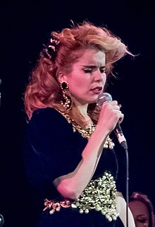
My page layouts correspond with LOUD AND QUIET magazine because I felt this was best for attracting my chosen target audience which is males between the ages of 16-25. My artist Shannen Jones represnts an artist such as Paloma Faith who is in the music industry currently. This is because she has a unique style to her voice and her fashion. This sets a good role model for my target audience and I believe to be a very talented artist.
The layouts of my page reflect the indie genre, as they represent individuality, which in this present day seems to be a big topic with regards to fashion statements and trends.
Tuesday, 18 March 2014
DRAFT - Question 1
 1. In what ways does your media product use, develop or challenge forms and conventions of real media products? (i.e. of music magazines)
To ensure that my magazine reached it’s maximum potential, I
went through a research stage which involved looking at a variety of different
magazine styles, as well as past work by other students. By doing this I found that magazines that follow a similar structures and conventions are the most successful. This is due to the detailed understanding of which target market the magazine is aimed at. With such a detailed understanding, they can chose a cover model that perfectly suits their target market and know how they need to be represented.
LOUD AND QUIET use the rule of thirds very effectively to present the magazine in a way it would stand out to on a shelf, and this is a technique that I wanted to adapt to my own design. I wanted The three main aspects of my cover to stand out-Masthead, image and content, each aspect crucial to my design. This is a very common convention used widely in the industry, along side the spiral effect which is generally used on images to ensure the main focal point of the photograph. However, I did not require the use of the spiral effect as the artistic elements of my cover image did enough to draw attention for not only those of my target audience, but other audiences as well, particularly if on a shelf with a variety of other magazines. In regards to colour, I also adapted the black and white house theme leaving just the central image to take focal point. By reducing the content of text on the page I was able to reduce the 'busyness' of the cover to increase the overall aesthetic.
When it came to designing my magazine I kept in mind the main conventions to ensure that elements fitted within my genre, however ensuring the individuality was still noticeable through out the design and layout.
For my masthead, I challenged the conventions with regards to colour by using white, which is not known for being bold or to stand out. I used a 'revolution' font due to it's bold style, and I developed the boldness through the use of overlapping the fonts. I used an overlap effect for my masthead, to be different, which is initially what the term 'indie' represents. I believe along with the font, this enables it to stand out and capture my target audiences attention. I placed the masthead slightly lower than the top of the page, to ensure that my border was used to great effect, and framed the photo, to show off it's artistic features especially the eyes, as these attract the male gaze. I also decided to not have anything over lapping the masthead, only the border because this also develops the covers individuality if on a shelf in a shop with a wide variety of other magazines.
The graphological features of my magazine are purposely there to ensure that it is diverse, and looks particularly different in comparison to every other magazine on the market, regardless of my magazine not being the only indie one. I found inspiration sources from magazines such as LOUD AND QUIET and Clash, due to their exquisite and artistic ways of presenting images and text with the use of negative space. I, however decided to break the conventions of these magazines and didn't use the negative space effect to the extent to which I wished to, because i felt that the images I produced with the chalk effect were artistic enough to attract my target audience, as well as others.
My favourite page with regards to the graphological features which I have presented is my cover, as I feel the 'revolution' font works when leaked into the border. I also like the sizing of my image, as it really presents the male gaze features which will attract my target audience, regardless of whether they follow indie music or not. This is also a house style which I have developed throughout the piece of work, as it links all pages together to show there is a connection.
When using conventional features with regards to photography, I decided to think outside the box and use chalk to give off a unique effect which allows focus to be drawn to that solely, rather than relying on the masthead to grab attention. I believe that this was a way of developing my photography skills to which would make my images seem more professional when looked at by my target market. I followed the conventions of a 'perfect' photograph because my model looked into the camera in all of the photos that I used in my magazine. This is to capture the audiences attention.
My magazine has challenged conventions to and extent, to ensure that it is diverse and individual. However I believe that I stuck by the most important ones, to ensure my magazine remained graphologically like a magazine.
Tuesday, 11 March 2014

Monday, 10 March 2014

FINAL DOUBLE PAGE SPREAD
DUE TO ERRORS WITH TECHNOLOGY, MY DOUBLE PAGE SPREAD IS CURRENTLY NOT ON MY BLOG. HOWEVER IT WILL WILL UPLOADED AS SOON AS POSSIBLE.
SORRY FOR ANY INCONVENIENCE CAUSED!
Sunday, 9 March 2014
Changes After Teacher Feedback
From my teacher feedback, I have to alter my house theme for all three pages, however keep my colour palette the same. This is because my original house theme was not clear enough, and needed a lot of work as it was not bold enough.
I chose to change the style of my cover, and the cover image because my teacher felt that the artistic aspects were enough without editing the image in any way. These changes are vital to ensure that I create the best magazine possible.
Saturday, 8 March 2014
Teacher Feedback - DRAFT
Cam Vear feedback
FRONT COVER – LEVEL 2
WWW
Photo idea – great styling
Colour
EBI
Not sure title works
The bar code won’t actually work
I wouldn't bother splitting her face, make up alone is enough to make her interesting – half a face
Date and issue fonts are odd. Sort that out
‘maybe’ bands at the bottom if you go with just one photo – if you only have half a fce you’ll have space to include some
CONTENTS –LEVEL 1
WWW
Attempt at house style
EBI
Too busy yet paradoxically not enough happening
Too little in your magazine
Lack of images
Caption
No page no/branding evident
Text too big – caps off?
Poor choice of font
Very short magazine (52 pages)
Lacking style
Even a contents should follow a rough layout style
DPS – Level 1
WWW
EBI
NEED TO SEE IT!
Tuesday, 11 February 2014
DRAFT Reflection
In order for us to able to self asses our own work, we must ensure that we are able to correctly mark magazines that are both similar and different to our own. We must correctly place each feature of these magazines in the correct band to reflect the skills that have been used. Also, I will then go onto to peer mark, and give constructive feedback to my fellow peers, as well as reflect on my own work.
Monday, 10 February 2014


Sunday, 9 February 2014
Reflection of this week & Next weeks objective
 During the period of this week, I have completed a lot of tasks that have allowed to me stay organised and on top of the work set. However, the highlight of the week of the week was my photo shoot which I believe went incredibly well, and my images came out just as I had hoped. The preparation of the Photo shoot required me to have to use my organisation skills to book out my shoot space, the required equipment and make sure my model was available.
 Also, I began to design and create my flat pack model, which did not go as well as expected, and this was due to the fact that I was not very experienced with the software and it's layout. I then went of to conduct my survey as well as evaluate feedback from my teachers, other peers and my target market, as well as giving my fellow peers feedback on their 25 work presentations. To guarantee that my feedback was constructive, I carefully planned my comments to ensure there was valid points of improvement.
I feel that this week was very productive, however I feel as though I have spent too much time into the creative side of the coursework, and not enough on the substance and written elements of the coursework. Each week my published post amounts are on average the same, however I believe that they are becoming more detailed as the coursework progresses. I was keen to show how much effort and thought went into this weeks posts to show exactly was I am capable of.
 My main objective for next week is to complete my flat plan content and double page spread, as well as thoroughly evaluating it in detail. I am also hoping to extend my research even further in order too retain the highest amount of marks possible, and to also see if I can use this as inspiration. My biggest aim of next week is to complete my draft article, contents and double page spread, and hopefully meet the class deadline.
Friday, 24 January 2014
CD Album Covers
For my indie solo artist, I decided to create two album cover, to display the variety of skills that I have when it comes to creating and designing possible merchandise. I wanted my theme and concept to be present in every aspect of my artist as possible, and I believe that I was successful at this with the album covers. The reason I chose to use strange and obscure photography is because I felt that it fitted my indie theme and was very different from any photography I had seen before, and this is what my artist is about. Furthermore, it would also attract my target audience because followers of indie culture prefer things that are not classed as normal.


Article - Draft
"Your world is too mainstream.. so I made my own!"
To Shannen Smith, being individual isn't just about looking different, but simply living in a world in which only she understands. "If it's my own world, it does not matter if others do not understand it". Growing up Shannen knew she was different from the boring humans around her, and this aspect of her life quickly took over. By the age of 10 she was shopping in thrift shops looking for vintage clothes that would take her look to the next level. Strange I know... but just bare with her! Her obsession then infested its way into her tastes in music and interests, and before she knew it she had created her own bubble. Her bubble consisted of vintage and rare items of clothing, and stretched to the extremes of shaving her hair all in aid of being 'DIFFERENT'. Now if someone walked past you on the street with bright pink hair, wearing a jacket from the 40's, you are more than likely going to stare, but for people like Shannen its all that unwanted attention that spurs her on to be even more unusual. "For me it was important to test my boundaries at a young age, that way you have no boundaries for when you get old!" Her life has been consumed by unusual tastes in fashion, music and media from the womb, and yet she has no regrets as she believe it was this ambition to be individual that drove her to write such successful music. Her music has been as influential all around the music, as her styling and aesthetics.
Shannen is also grateful for her support from social media sites such as YouTube, Twitter and Facebook as they allowed her to spread her slightly bizarre image and music style. She was first recognised by producer Henry Stevens (Future Records) over the internet, and from then, her future was set. Her first hit 'Unorthodox Jukebox' reached number one in over 13 Countries, and still to this day her popularity grows, and there is no sign of it stopping. Her recent album 'The black and white rainbow' is due to be released in May 2014, but if her earlier hits are anything to go by, this album will be not exception to her success. "I am thankful for all of the support I have received.. but in all honesty I only started singing because I had nothing better to do". Her unique style is something that has not gone unnoticed.. but with that hair it's not bound to. She has been described as a 'Pioneer of music' and she continues to lead the way for 'Indie' music and fashion all over the world.
To be indie or not to be indie... that is the question
What is 'Indie'? This is a question that has been asked since the birth of Jesus, and is still asked quite a lot today. Wearing a fruit basket on your head does not make you indie.. so what does make a person indie? Is it their hair style? Is it their sense of fashion? or is it just generally their state of sanity? In fact all of these are contributions to what make a person individual. There is a broad spectrum to what we normal folk class as being indie, and the difference between being indie and a psychopath. To make it easier to understand, I have created my top 5 for what make a person individual.. and no a fruit basket on your head is not included. The list is as follows;
In fact, none of these have to be present for a person to be individual, as there is no stereotype to what makes a person indie. However the key to being indie is to not care about others opinions of you, and to be what you are without having to explain yourself. As the great William Shakespeare used to say 'To be indie, or not to be indie... that is the question.' Indie people have no specific image, they are just what they are... and most of them probably do have SILLY HAIRCUTS.
To Shannen Smith, being individual isn't just about looking different, but simply living in a world in which only she understands. "If it's my own world, it does not matter if others do not understand it". Growing up Shannen knew she was different from the boring humans around her, and this aspect of her life quickly took over. By the age of 10 she was shopping in thrift shops looking for vintage clothes that would take her look to the next level. Strange I know... but just bare with her! Her obsession then infested its way into her tastes in music and interests, and before she knew it she had created her own bubble. Her bubble consisted of vintage and rare items of clothing, and stretched to the extremes of shaving her hair all in aid of being 'DIFFERENT'. Now if someone walked past you on the street with bright pink hair, wearing a jacket from the 40's, you are more than likely going to stare, but for people like Shannen its all that unwanted attention that spurs her on to be even more unusual. "For me it was important to test my boundaries at a young age, that way you have no boundaries for when you get old!" Her life has been consumed by unusual tastes in fashion, music and media from the womb, and yet she has no regrets as she believe it was this ambition to be individual that drove her to write such successful music. Her music has been as influential all around the music, as her styling and aesthetics.
Shannen is also grateful for her support from social media sites such as YouTube, Twitter and Facebook as they allowed her to spread her slightly bizarre image and music style. She was first recognised by producer Henry Stevens (Future Records) over the internet, and from then, her future was set. Her first hit 'Unorthodox Jukebox' reached number one in over 13 Countries, and still to this day her popularity grows, and there is no sign of it stopping. Her recent album 'The black and white rainbow' is due to be released in May 2014, but if her earlier hits are anything to go by, this album will be not exception to her success. "I am thankful for all of the support I have received.. but in all honesty I only started singing because I had nothing better to do". Her unique style is something that has not gone unnoticed.. but with that hair it's not bound to. She has been described as a 'Pioneer of music' and she continues to lead the way for 'Indie' music and fashion all over the world.
To be indie or not to be indie... that is the question
What is 'Indie'? This is a question that has been asked since the birth of Jesus, and is still asked quite a lot today. Wearing a fruit basket on your head does not make you indie.. so what does make a person indie? Is it their hair style? Is it their sense of fashion? or is it just generally their state of sanity? In fact all of these are contributions to what make a person individual. There is a broad spectrum to what we normal folk class as being indie, and the difference between being indie and a psychopath. To make it easier to understand, I have created my top 5 for what make a person individual.. and no a fruit basket on your head is not included. The list is as follows;
- Wear clothing that would not be classed as 'NORMAL' or 'EXPECTABLE' in public
- Make your hair look as though the hairdresser did it by accident..
- Not caring about what people think, except your mother.. as she is always right!
- Listening to unconventional music with unconventional instruments (Often includes the spoons and a banjo)
- Having a calm and cool approach to every situations (WITHOUT THE USE OF ILLEGAL DRUGS)
In fact, none of these have to be present for a person to be individual, as there is no stereotype to what makes a person indie. However the key to being indie is to not care about others opinions of you, and to be what you are without having to explain yourself. As the great William Shakespeare used to say 'To be indie, or not to be indie... that is the question.' Indie people have no specific image, they are just what they are... and most of them probably do have SILLY HAIRCUTS.
By Cameron Vear
(UNDOX Editor)
Thursday, 23 January 2014
Institution (Bauer Media)

Information: Bauer Media is a division of the Bauer Media Group, Europe’s largest privately owned publishing Group. The Group is a worldwide media empire offering over 300 magazines in 15 countries, as well as online, TV and radio stations.
Bauer Media is a multi-platform UK-based media Group consisting of many companies collected around two main divisions – Magazines and Radio - widely recognised and rewarded as being industry innovators.
Our business is built on influential media brands with millions of personal
relationships with engaged readers and listeners. Our strategy is to connect audiences with excellent content through our broad multi-touch point brand platforms, wherever and whenever and however they want. Our wide portfolio of influential brands gives us advantages over pure play magazine or radio competitors.
Our magazine heritage stretches back to 1953 with the launch of Angling Times and the acquisition in 1956 of Motor Cycle News, both still iconic brands within our portfolio.
The seeds of the company’s radio business were planted in 1990 with the acquisition of London dance station Kiss FM (now called Kiss 100), followed by the acquisition of Liverpool's Radio City and later by TWC and the Metro Group. Then came the acquisition of Melody FM which was transformed into the market-leading Magic 105.4.
In 1994, the company bought a small magazine called For Him Magazine which is now the core of the best-selling international multi-platform brand FHM.
In 1996, we acquired digital music TV channel The Box, as a route into the small screen business, which has grown into Box Television, a seven channel joint venture TV business with Channel 4.
Continuing its history of magazine launches, Closer was launched in 2002 and Britain’s first weekly glossy, GRAZIA, was launched in 2005.
Today, Bauer Media spans over 80 influential brand names covering a diverse range of interests including heat – the must have weekly celebrity title, Parkers, MATCH!, CAR and Yours. For a full list our powerful brands.
Bauer Media is a sister company of H Bauer Publishing, publisher of the UK's biggest TV listings, Take a Break and Bella.
All of the information above has been sourced from the BAUER website. It includes the range and capacity they offer their services. In order for the text to become personal for an audience, they use very direct and personal pronouns when describing the institutions aims. As a global institution, they believe that it is their job to capture the attention of readers and listeners of all types of media's and audiences to be globally recognised.
The reason I chose Bauer Media as my institution is due to the fact that are a large organisation which influences a large audience in regards to types of media. Bauer Media also has connection with other large institutions, not only in the UK, which means my magazine would be subject to a larger market. By aiming it for audiences outside the UK, other countries would be able to follow trends and music from UK musicians and stylists. This would give me to ability to advertise and publicise artists to a wider audience, which would expand the musics global potential.
Subscribe to:
Posts (Atom)