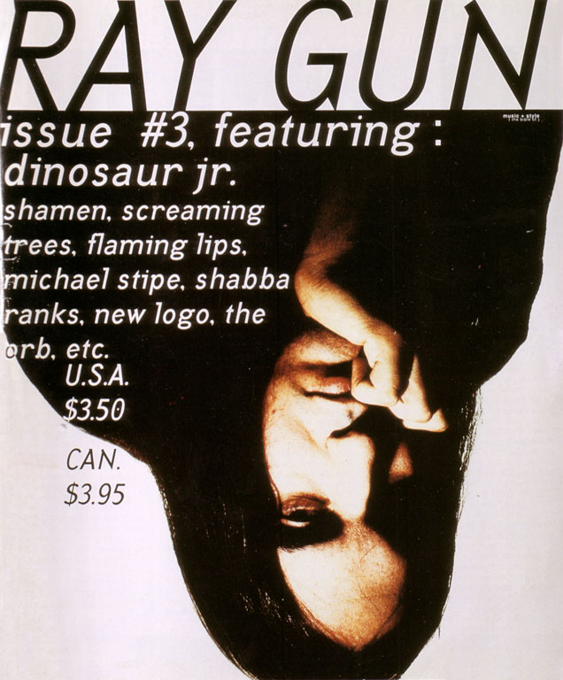
David Carson is renown worldwide for his inventive and innovative typography that he used in his graphic design work. He is best know for his work on the magazine 'Ray Gun' which as the art director, he put into practice some of his own typographic and layout designs. His style of work was categorised as being 'grunge typography' which was aesthetically pleasing for a wide range of audiences.
Carson was employed by Ray Gun publisher Marvin Scott Jarret to design the overall look of the Ray Gun magazine. Ray gun is known for being an alternative lifestyle and music magazine that was first released in 1992. The magazine featured a different and artistic approach to the overall design, which gives it an authentic, handmade quality.

 Carson left Ray Gun in 1995 to start up his own studio; David Carson Design, in New York City. Carson was doing work for Pepsi Cola, Ray Ban (orbs project), Nike, Microsoft, Budweiser, Giorgio Armani, NBC, American Airlines and Levi Strauss Jeans. And later worked for a variety of new clients, including; AT&T Corporation, British Airways, Kodak, Lycra, Packard Bell, Sony, Suzuki, Toyota, Warner Bros,CNN, Cuervo Gold, Johnson AIDS Foundation, MTV Global, Princo, Lotus Software, Fox TV, Nissan, quiksilver, Intel, Mercedes-Benz, MGM Studios and Nine Inch Nails.

My reason for choosing Carson as my graphic design inspiration is because his style is universal, but at the same time projects a unique design and feel, which as my genre is indie, this fits perfectly. Well looking in more detail at his favourite colour palettes, I found that they often differ in his designs which gives it a versatile image, making it different but still with in the music context.
No comments:
Post a Comment